Describe the improvement here, in one paragraph. Then fill the sections below.
What is the problem?
The Pattern mode on the play is often confusing when creating bigger arrangements.
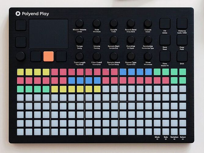
For complex arrangements it is often very hard to see where you are in the song/ arrangement. Because the patterns have no specific name and they all have the same colour. Especially that all pattern buttons have the same colour makes it in some situations for example when playing live difficult to see where you are in the song structure. Especially when you are concentrating on different instruments.
What do you want to achieve?
A possibility to name the patterns for example with song parts like intro, verse, break, outro etc. And most important the possibility to give the patterns specific colours. For example intro/ outro is yellow, verse is red, break is blue, chorus is green.
Are there any workarounds?
No.
Any links to related discussions?
I don’t think so.
Any references to other products?
I don’t know other products wich have this feature. Maybe the deluge has this feature.
