Bug Description
Not sure if this is a bug or a wish but the contrast ratio of the red outline is very low. When using the Tracker Mini outdoors for example, it becomes difficult to know if something is highlighted.
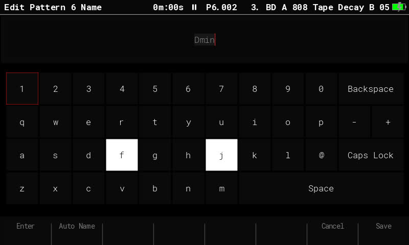
This is particularly difficult when using the onscreen keyboard and moving around the letters (e.g. when naming a pattern) but is also affecting the Song page (i.e. hard to see which step is highlighted in red).
Dark red on black makes for very low contrast. A lighter shade of red/orange/pink would make things easier if the screen technology supports that.
Some pages seem to have thicker red outlines (e.g. the sample loader page) which makes things easier.
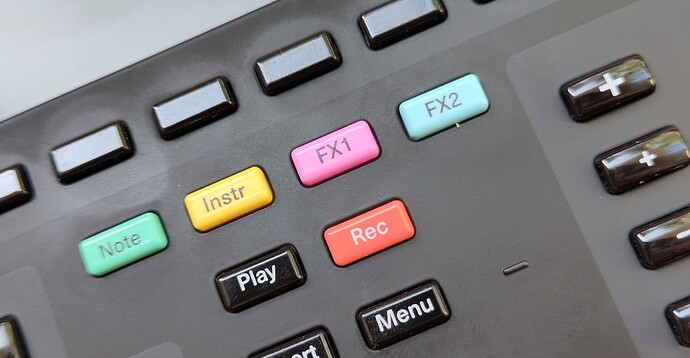
Actually if the highlight color were the same as the one for the Rec button, that would be delightful. To me that looks like a reddish salmon color.
A curb cut effect if the contrast ratio was higher across the board would be that users could dim the screen’s brightness in more situations (and use less battery).
Reproduction Steps
- Go outdoors.
- Go to the Pattern page.
- Select Pattern name.
- Try to rename without squinting. It’s difficult to see the red outline around the letters. The cursor is also elusive.
Expected the red outline to be clearly visible.
Occurrence
Always.
Found in
- Version: 2.0.0
- Build: 995
Attachments
The keyboard:
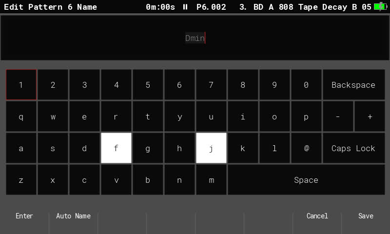
In monochrome:
The color of the Rec button could be a good alternative to the red:


