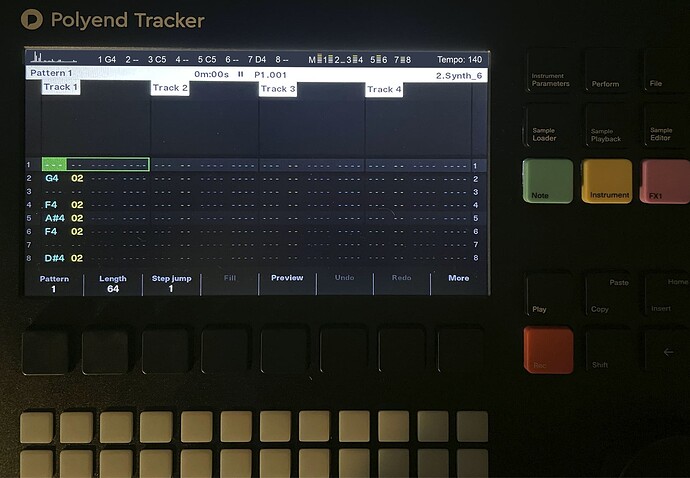
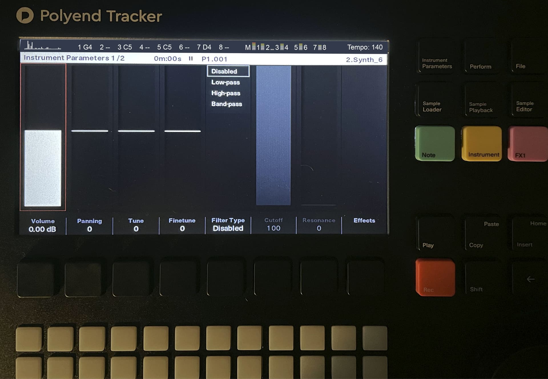
While possessing a phenomenally clear UI already, the Tracker could benefit from having a master “status bar” that would persist across all screens (pattern, instrument, master, etc…) located above the screen title. This status bar could present information such as a spectrogram, a series of 10 small volume meters (L and R master + 8 channel meters), a table showing the currently playing note values for each channel, and the current track BPM.
What is the problem?
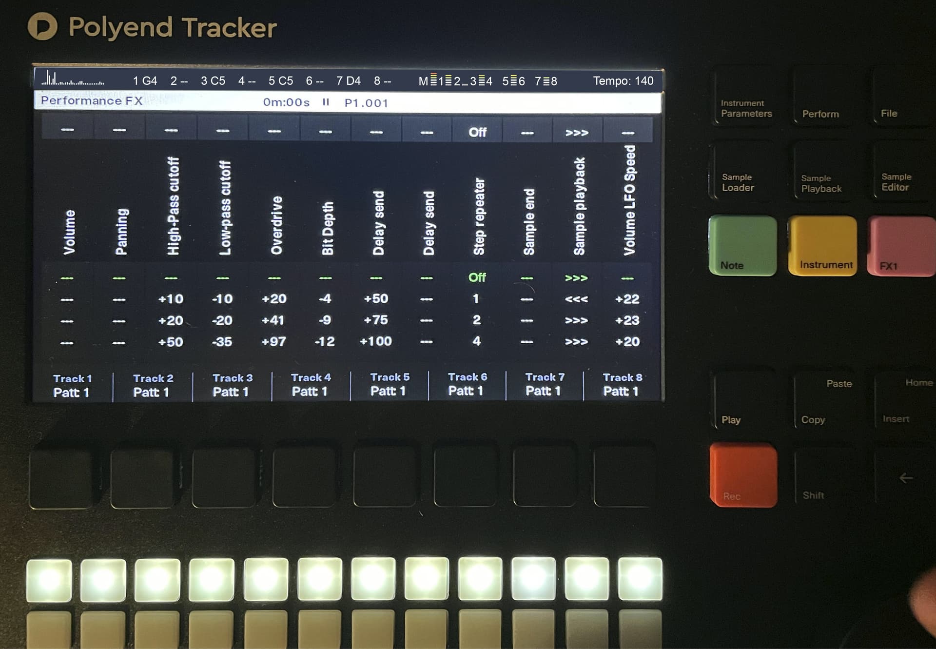
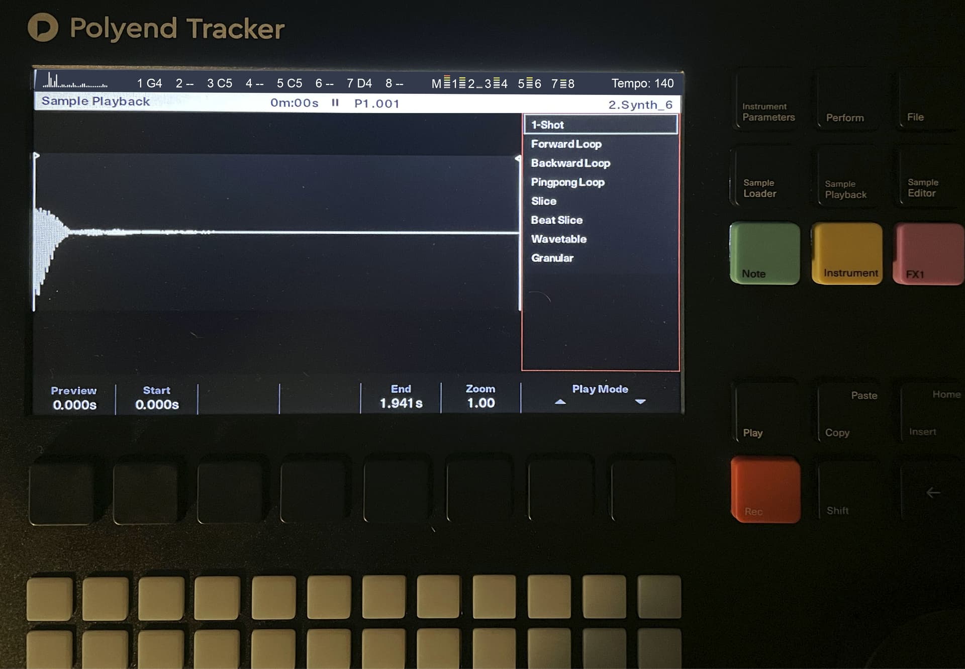
Currently the UI is focused on displaying information one “page” at a time, and information from other pages is locked behind those screens. This is clearly by design, allowing you to focus on one “task” at a time. You need a button press in order to see the current volume meters as you are entering notes on the pattern screen, for example. However, when creating music on the Tracker, it would be handy to see certain information about the song at all times. The status bar would allow for that.
What do you want to achieve?
By shifting the full UI down and creating a master “status bar” above the screen title, this would provide space for the types of information mentioned above. I’ve mocked up what this could look like below.
Are there any workarounds?
Currently all of the information mentioned above is found on their respective pages. There’s no workaround necessarily for what is described in this wish.
Any links to related discussions?
None
Any references to other products?
The Dirtwave m8 (and the LSDJ that it is based off of) has a feature like this: the information column on the right side of the UI.
Hi @tylrprtr, welcome to Backstage and thank you for an already very detailed wish.
If Polyend were to implement such a feature, which screen real estate do you think should shrink for the individual screens?. For example. On the sequencing screen - would you make the number of visible steps smaller? What about the other screens?
Hi @Sandroid! Glad to be a part of this amazing community for this amazing piece of hardware. Pictures probably communicate my thoughts better than words ever would. I’ve mocked up what this could look like on a handful of screens below (with some fake information in the step notes and volume meters). But yes, as an example, the sequencing screen would lose one step row in the current display. On the sample editor screen, there is already some blank space above the sample that could be reduced (and menu options slid down).
I try to wrap my head around why would it be useful to have master waveform, and I fail to see any benefits. Seems just like a gimmick, clutter. An all time visible clipping meter I see as useful, but waveform not.
What is your reasoning to have master waveform?
I now see than on pictures there is spectrogram, which is much more useful, showing the frequency range. – It would help, but Polyend needs to fix non-working EQ first (sample edit EQ effect does absolutely nothing, Master EQ is minimally noticeable).
I am very fond of clean visual UI. I would just add that there have been many cases where I want to know the name of the project I am working on, but right now I have to go to either song mode or file mode to see it. It would be useful to know the name of a project immediately one turns on the tracker.
@Radiowaves When I started working on the mock-up, I reached the same conclusion you did: The waveform, while a great visualization, is not as necessary on a device without onboard synth engines. But a spectrogram could be helpful to see overall track balance. (Typing this also makes me think a stereo volume meter with peaks could be helpful as well).
As an aside, there may be a place for a visualization page on the perform or master screens. Something to set to while jamming and filming the device. That’s not everyone’s workflow, but there is a subset of users that perform from the device and record videos of those sessions and it would be nice to park the device on a screen with some visualizations, whether that’s track waveforms or an XY oscilloscope or something along those lines).
To critique my own idea: the issue with the status bar idea is that right now the Tracker UI is great in that for every piece of information that is on the screen, there is a button or a button combination to change that information. In the case of this status bar as I’ve been envisioning it, all of that information is only for viewing, you would have to go to the specific screen to change any of those values. That goes against the current UI philosophy.
Great idea…maybe can have some further usage, for instance, visualizing the compression/limiter levels on the sample editor, visualize a little graphic eq (useful to more consistent editing, takin apart the eq offline FX need to be fixed), or maybe something else, don’t know.