Its a long read, I know…
This is an idea that I hope makes it to the Wishlist. But before I put it into that context I thought it might be a good idea to flesh it out a bit. Its just a discussion, participate if you want but please don’t feel its a must and don’t feel threatened. Its just an idea. Also, I am coming at this as a Play owner, not a Play+ owner. Thanks in advance to Polyend for allowing this and other discussions like this one to happen on their boards.
Current state:
The UI presents 8 tracks on screen. That screen shows 16 steps. There can be up to 4 screens allowing for 64 steps in total for each track. Currently we have a highlighted step (cursor) that travels across the screen indicating which step is being triggered. Each track can have a different play rate so the cursor for each travels at a different speed. This means that any track screen that is currently in focus will often times not show all track cursors if they have had their respective rates changed. The cursor then goes off-screen and if you don’t chase it down you just have to wait until it comes around again. Also, there is a tie-in for this idea that will make it a bit more straight forward to address current selected samples/preset.
Idea: Part one
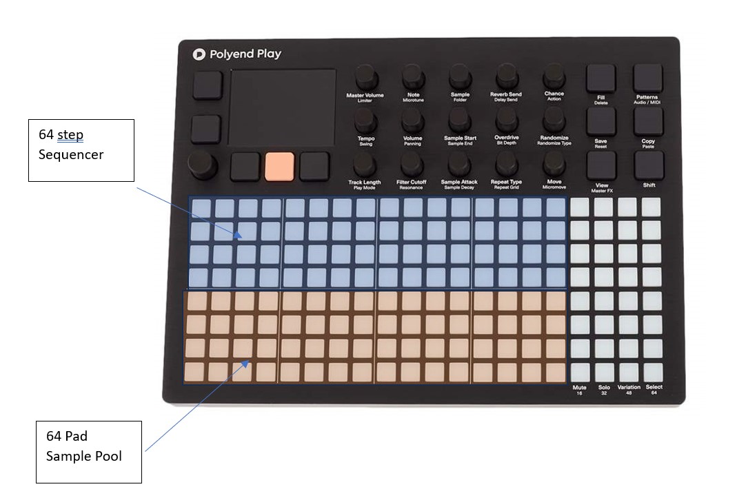
What if there was another view that allowed us to work on one track at a time and see all 64 steps at the same time. Imagine, the top four rows are steps 1-64 for a selected track. The cursor would travel left to right on row one, then two, then three, then four. It would always be on screen as well as the highlighted steps that have triggers. Thus providing a different way to interact with those 64 steps.
Idea: Part two
What if the bottom four rows contained references to each sample in the sample pool. Well, up to 64 samples that is (I don’t usually use that many samples in a project so I hope I am not offending those that do). I am not sure how they would get assigned to each step down there and I am not trying to address the mechanics of that at this point. Imagine if you selected a step, that step is now hightlighted and the four rows up top now also highlight each step that sample is on. And imagine that when a step is selected you hear a preview of that sample, and that is without it being placed on a step in the first four rows. However, at this point it is the selected sample and whatever steps it is placed on would be visually evident regardless of which of the four pages (or 64 steps) are chosen. And what if when you choose that sample the screen at the top left indicated that name of the sample chosen. We would always know the What and the Where of each sample chosen while still allowing multiple samples per track. I think it would remove a bit of uncertainty and provide another productive way to use the unit.
One and two are not in place of anything that curretly exists. The idea is to view what we already have differently. Track selection could still happen to the right-hand side. The only thin different in this view is we would only be able to work with one track at a time.
Idea: Part experimental
With the above in place what if you could create sample groups (already loaded in memory) by selecting pads in the bottome four rows. Then the random function could could choose samples in that group(s) maybe in lieu of folders.
Just spit balling a bit… I woke up in the middle of the night and this idea was there. Thought I would share it and see if anyone else sees any value in it. My apologies if it has been mentioned before. I have been a Play owner from almost the beginning and I don’t recall seeing it.
Your thoughts?